Ahi poke
A modernized brand identity and website to enhance user experience and support Ahi Poki’s expansion.
An exercise in branding, UX/UI design, and user research to elevate Ahi Poki’s digital presence. The goal was to refresh the brand’s identity, improve website usability, and create a more engaging customer experience. The redesign focused on modernizing the logo, color palette, typography, and website layout while ensuring a seamless ordering process and clear brand messaging.
Objective
My Role
Research
Branding Design
Web Design
Prototyping
User Testing
Tools
Sketch
Figma
Adobe XD
Duration
8 weeks
The Challenge
Ahi Poki’s existing branding and website failed to reflect its fresh, health-conscious, and laid-back California-inspired image. The logo and color scheme felt outdated, and the website lacked cohesion, clear navigation, and essential information like menu pricing. Users found it difficult to navigate the site, engage with the brand, and place orders efficiently.
The website needed to improve engagement, showcase Ahi Poki’s fresh seafood offerings, and support the brand’s expansion across the U.S.
How might we redesign Ahi Poki’s brand identity and website to create a more modern, user-friendly, and engaging experience?
Testing
Participants
8 participants were recruited from Ahi Poki’s target audience, including frequent fast-casual diners, health-conscious consumers, and seafood enthusiasts.
Methods
Brand Analysis
Competitive Research
User Interviews
Wireframing & Prototyping
Usability Testing
Findings
Users felt that Ahi Poki’s branding lacked personality and did not communicate freshness and quality.
Navigation was cluttered and inconsistent, making it difficult to find menu items and ordering options.
The website’s lack of pricing and clear menu descriptions led to frustration.
The ordering process was disjointed, requiring multiple steps without clear guidance.
A more cohesive brand identity was needed to differentiate Ahi Poki from competitors in the poke industry.
The solution
Brand Identity Refresh
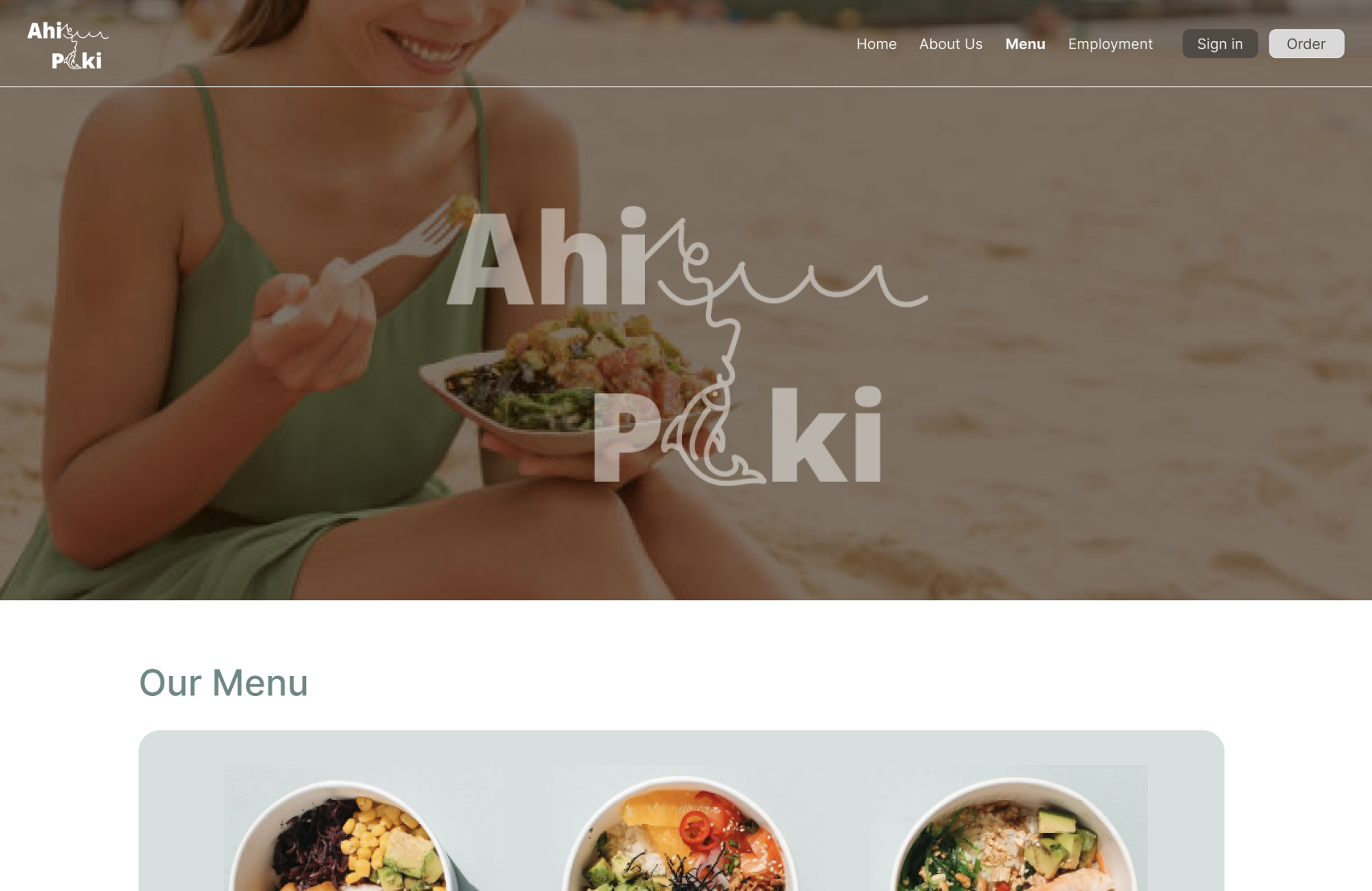
The new logo incorporated elements of fishing, using the “i” and “o” in Ahi Poki to represent a person fishing. The design also featured wave elements, reinforcing the freshness of the seafood.
A beach-inspired color palette of soft blues, sandy beige, and earthy tones was introduced to reflect the coastal, fresh, and relaxed brand image.
Modern, easy-to-read typography was selected, combining Bebas Neue for headings and Open Sans for body text, ensuring a clean and approachable look.
Website Redesign
The website underwent a full redesign, improving both functionality and visual appeal. The homepage, about us, menu, employment, and order pages were completely revamped to create a seamless, intuitive experience.
A clean, easy-to-navigate menu page was designed, featuring clear item categories, descriptions, and pricing.
The order page was streamlined, integrating direct links to third-party delivery platforms for faster ordering.
An employment page was added, featuring a simple application form that allows users to submit job inquiries directly through the website.
Key Features
A clear, intuitive navigation structure was implemented, ensuring users could quickly access menu options, ordering services, and job applications.
A fully responsive design was created to provide a seamless experience across all devices, catering to mobile users on the go.
A modernized menu page showcased Ahi Poki’s offerings with detailed descriptions, pricing, and high-quality imagery.
A dedicated employment page simplified the job application process, encouraging potential hires to apply with ease.
The ordering process was streamlined by integrating delivery service links, eliminating unnecessary steps.
Testing & Validation
Usability Testing Tasks
Participants completed key tasks to evaluate the effectiveness of the redesign, including:
Navigating the new menu and finding pricing information.
Placing an order using the new streamlined ordering system.
Applying for a job through the employment page.
Exploring brand storytelling through the new About Us section.
Results
Task completion rates improved significantly, with users navigating the menu 30% faster than before.
Frustration levels decreased by 40%, as participants found it easier to locate essential information.
Users responded positively to the modernized branding, with many noting that the new visual identity felt fresh, inviting, and high-quality.
The streamlined order process led to smoother user interactions, reducing confusion and improving engagement.
Next Steps
Conduct A/B testing to refine elements of the menu layout and improve information hierarchy.
Expand content by adding customer testimonials, detailed company history, and nutritional information.
Align branding across social media, packaging, and marketing materials to ensure a cohesive brand presence.
Implement post-launch analytics tracking to measure user engagement and identify areas for continuous improvement.
Reflection
This project reinforced the importance of user-centered design in branding and web development. By refining Ahi Poki’s visual identity and website structure, the brand was able to better communicate its fresh, coastal-inspired identity while providing an intuitive and engaging digital experience.
The revamped branding and redesigned website position Ahi Poki for growth and expansion, ensuring that new customers can easily discover and engage with the brand.
Further refinements and strategic marketing efforts will continue to strengthen Ahi Poki’s digital presence, helping it stand out in a competitive fast-casual dining space.


